
 RSMUS.com
When working with Power BI, a great way to test the functionality is to attach your desktop to a sample SQL database hosted in Azure. The dataset that we will be using is called AdventureWorks. This is familiar to many programmers as Microsoft has reused this example many times for different programming techniques. In this exercise, we will be using the content from the database to create a variety of sample visualizations.
This article is the continuation of a series on Power BI and the capabilities of the product. The purpose of this walkthrough is to use data to quickly model a sample page that can be published to PowerBi.com. The assumption of this article is that you already have an Azure Active Directory account that is tied to your Power BI account. In addition, it assumes that you have already downloaded the local desktop version of Power BI.
Connect to the Azure database
For this part of the process, you will need to launch the Power BI desktop. If you have not, simply go to powerbi.microsoft.com, log in, and download Power BI before you follow the steps in this section.
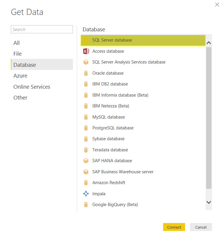
To attach the data source in PowerBI:
- Open the Power BI desktop.
- Click Get Data.
- Choose Database.
- Select SQL Server database

- Click Connect
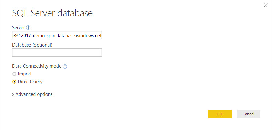
- Enter your server name in the Server field
- Click OK.
- Click Database.
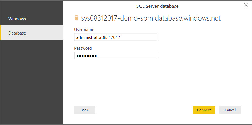
- In the Azure website, copy the server admin login username.
- In Power BI, paste the username into the Username field
- Enter the password you created for your Azure database.
- Click Connect.
- Select the database name.
- Select the following tables:
- Customer
- Product
- ProductCategory
- SaleOrderHeader
- SalesOrderDetail
- Click Load.

Tying the data together as a model
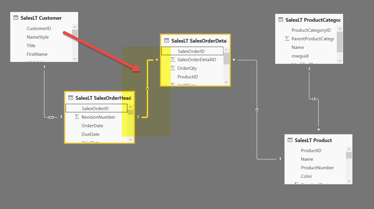
One of the key steps is to ensure that the data is connected. Once we have added these tables in the previous steps, you will be able to review the tables in the Relationships view. Based on the data, Power BI will attempt to link the data from the various tables based on column names. If this is a well-constructed relational database with all of the key linking tables, the process will be accomplished quickly.
To check the relationships:
- Click the Relationships This will display:
- Double click a relationship, such as the one between SalesOrderHeader and SalesOrderDetail.
- Notice that they are linked by SalesOrderID, many details to a single header.
- Click Cancel.
- Select the Report.

Rendering in Power BI
We are now ready to render the data in PowerBI. If you are unfamiliar with the data set or would like to review it, use the Data view.
To create sample visualizations:
- Click the Stacked column chart
- From Customer, drag CompanyName to Axis.
- From SalesOrderDetail, drag UnitPrice to Value.
- Click off the visualization.
- Click the Treemap
- From ProductCategory, drag Name to Group.
- From SalesOrderDetail, drag OrderQty to Values.
- Click off the visualization.
- Click the Card Optionally use the Gage visualization.
- From Product, drag ProductID to
- Click off the visualization.
- Click the Donut chart
- From Product, drag Color to Legend.
- From Product, drag ProductID to Values.
- Click off the visualization.
- Click the Stacked column chart
- From Customer, drag Name to Axis.
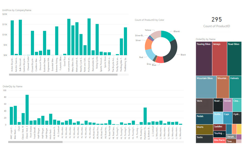
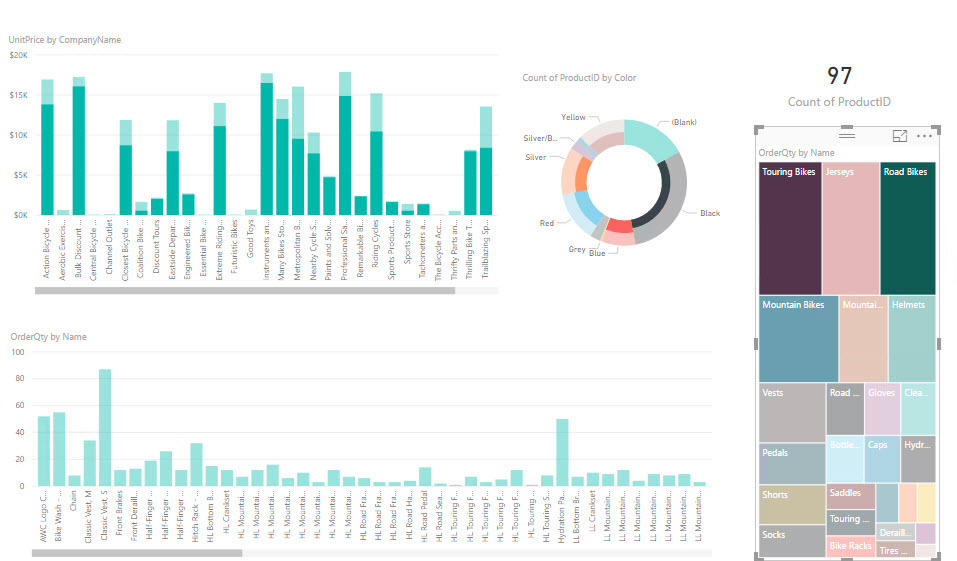
- From SalesOrderDetail, drag OrderQty to Value. Here is a finished view
- Now click into the visualizations to see the interaction. For example, in the OrderQty by Name treemap select only the Touring, Road, and Mountain Bikes. Here is a sample.
Conclusion
This article explored the process of using a sample Azure database for visualization. First, we connected to the data set. Next, we imported the tables and checked their relationship. Finally, we created different graphs and types of charts to view our date. Through the process of creating several different renderings of the data, you can quickly interact with the set of information and create inferences for decision making.
For more information, I would recommend that you attend our Power BI training in person or on-demand online to learn more.
Keep an eye out for more articles that dive into the technical aspects of PowerBI DAX language and X++ coding. Visit academy.rsmus.com for more information and training materials that will cover this and hundreds of other topics for PowerBI, AX2012, and MsDyn365.
by Shaun McMikle for RSM
RSM Staff
RSM empowers middle market companies worldwide to take charge of change. Our unique middle market perspective makes RSM the natural choice for growth-oriented, internationally active organizations seeking relevant insights and tailored, innovative solutions for a complex and changing world. With a global reach spanning more than 120 countries, we instill confidence in a world of change by bringing the full power of RSM to make a lasting impact on our clients, colleagues and communities.