- Creating a Work Breakdown Structure
For demonstration purposes, we will be using a construction project as an example. To begin, navigate to the relevant project under the “projects” tab and click on the “Tasks” section for that project. This section allows you to build a task hierarchy and add necessary details to the tasks. For each task, press “Add new task” and use the ellipses to convert any appropriate tasks into a subtask to allow for better categorization. After adding all your tasks, your screen should look something like this:
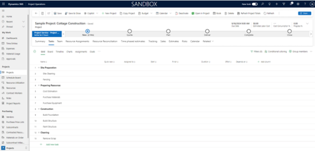
After creating a task, users can add task attributes. These attributes can be added by filling in the columns to the right of the specific task with the appropriate details. Alternatively, you can click the information button next to a task and fill out the information from there. You can add/remove columns to fit project objectives. Some attributes include start and finish date, effort level, dependencies, progress, buckets, goals, and priority.

The following sections will go into deeper detail about some of the features that can be further utilized for a work breakdown structure.
- Conditional Coloring
Conditional coloring allows users to visually differentiate tasks based on specified criteria. This can make it easier to track progress with tasks and quickly identify any issues. To do this, click the “Conditional coloring” button located in the top right corner of the tasks screen. The pop-up window will then display options to select fields, define your criteria, set the formatting, and add more conditional coloring. For this example, we will make a conditional formatting that fills any tasks with urgent priority as red and high priority as orange. To achieve this, the conditional coloring box should look like this:
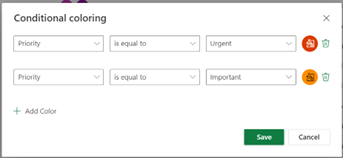
Additional uses for conditional coloring can be applied to tracking, status, allocation, and grouping of specific fields.
- Changing and Using the Different Views
Along the top of the tasks panel, users can switch between different views to get deeper understandings of their work breakdown structure. These options include grid, board, timeline, charts, assignments, goals, and people:
- Grid: The default view that has been discussed thus far and displays tasks in a tabular format. Each task is a row, and the associated attributes are columns, similar to a spreadsheet format.
- Board: Allows you to view and add tasks grouped by a specified category, giving a customizable and broken-down view of the different tasks. Tasks can be grouped by bucket, assignment, progress, finish date, labels, priority, sprint, and goal. The screenshot below shows what the board view make look like when grouped by bucket.
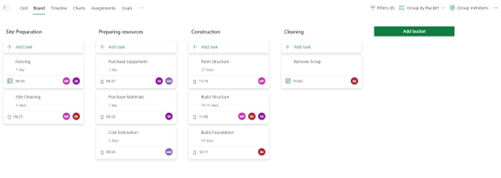
One useful way to group tasks, for example, is by sprints. Doing this would allow users to effectively time and track their progress in the project. To add sprints, simply press the “Add sprint” button and set appropriate dates related to the new sprint. Then, users can add tasks to the sprint.
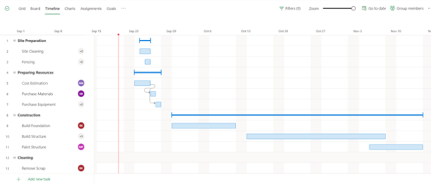
- Timeline (Gannt chart): A chronological view of all the task dates and duration, dependencies, and buckets. This section allows users to easily view the timing of the project to ensure that they stay on track. It also allows users to adjust dates by simply clicking and dragging the boxes generated on the timeline. For example, to make the “Site Cleaning” task longer, you can pull the right side of the associated blue box further down the timeline.
- Charts: Provides a visual representation of data through a variety of graphs and charts such as pie charts and bar charts. The default charts shown include status of tasks, status of buckets, and effort per person. This section helps users have an overall picture of the project in one, easy to understand, dashboard.

- Assignments: Provides a people-based breakdown of tasks by displaying all team members along with the tasks that have been assigned to them. This also displays their total effort for all tasks throughout the project and daily.

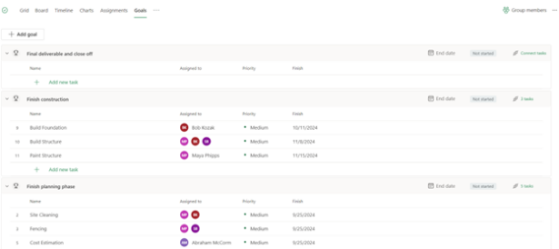
- Goals: Used to create and track project-specific goals. Upon creation, users can link tasks needed for the goal and to add a color to the goal for better visualization within grid view. In addition, users can update the status of goals to be one of the following categories: not started, on track, behind, at risk, and closed. Each status also has its own color associated to it as well.
- People: This view is like the assignments tab as it displays tasks broken up by team members. However, the people view is more focused on task completion and progress, rather than effort.

- Using Labels to Improve Project Management Efficiency
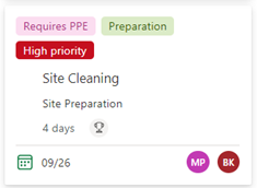
As previously discussed, there are a variety of ways to visually group different tasks. This section will go into more detail about the different labels users can apply and how it can be used efficiently. By default, the labels are titled based on their appropriate color. To rename them, a user can navigate to the label column in grid view or the details pane and press the pencil icon.

Labels can be renamed to fit any business, need making them very customizable and a great way to visualize different categories of tasks. These labels can then be seen within the grid and board views.
By understanding the different capabilities and features that the Project Operations app provides for work breakdown structures, companies can improve operational efficiency. The tasks sub-section allows for highly customizable organization of tasks with a variety of different views and functions. We hope this has helped you gain a deeper understanding of improving work breakdown structures through Dynamics 365.

 RSMUS.com