
 RSMUS.com
When working with Power BI, one of the most used and highly interactive features is the map feature. Power BI maps allow the consumer to quickly relate cities, regions, states, and countries with data. This capability has greatly expanded over the past 20 years in the commercial world and now is readily available to the end user.
This article is the beginning of a series on Power BI and the capabilities of the product. In a departure from my usual blogs, this one uses a non-standard data source instead of Dynamics 365 for Operations or new Microsoft Flows. The purpose of this exercise is to simulate the day that your boss walks into your office with a 30-year-old document about a legacy database format that you now need to incorporate in to Power BI maps. This is designed as an imperfect example that poses more challenges than using modern data entities and flow structures, which I will cover in future posts.
With the recent spike in genealogy researchers, purchases of DNA kits, and the awareness of family history through database connections, I chose an obscure database format as the source data source for our project. In this walk-through, we will take a Genealogical Data Communication (Gedcom) file, which is the format for exchanging data between genealogical software tools, and converting it for use in Power BI for mapping purposes.
Setup
For our process we will need a Gedcom file. In almost every genealogy software tool, with few exceptions, you can find this download process in the main menu structure. You can likely use the software’s help feature if you cannot readily find the file you need. After you have the Gedcom file, you will need to convert it for use. I have a free software solution example here.
Converting the Gedcom file
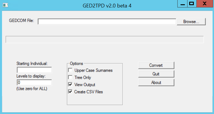
- Download and install the software GED2TPD from this website: http://users.wowway.com/~jaylor/jaylhouse/ged2tpd/ged2tpd.html
- Run the ged2tpd application from the source folder.
- Click Browse… and select your Gedcom file that you downloaded from your genealogy software.

- In the Levels to display field, type 0.
- Select the View Output check box.
- Select the Create CSV Files check box.
- Click Convert.
- Once the file has converted, click
Prepare files
- Open Microsoft Excel.
- Click File >
- Browse to your newly converted file named Person and click OK.
Note: This will create an error in newer versions of Excel. If you receive an error, click Yes to open.
- In the Text Import Wizard, click Next to use the delimited file format.
- Validate that the Delimiter is set on Tab and click Next.
- Click Finish.
- Click File > Save As.
- In the File name field, type Person_Converted.
- In the Save as type field, select Excel Workbook from the drop-down menu.
- Click Save.
The Configuration
For this step, we will need to get the data and prepare for use. To do so, you will need to download the latest version of the PowerBI Desktop. You can find it at: https://powerbi.microsoft.com/en-us/desktop/. This account is free and requires no other paid subscriptions.
Launch PowerBI Desktop and get data
- Open PowerBI Desktop.
- Log in or create a free account.
- Once PowerBI Desktop opens, click the Home tab > Get Data in the External Data Group.
- Click Excel and browse to the Person_Converted Excel file.
- Click Open.
- Select Person under the xlsx folder.

- Click Load.
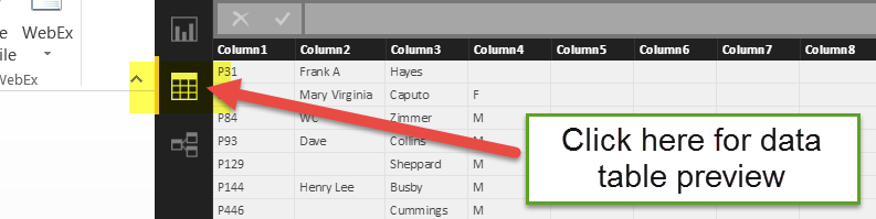
- Click the Data Table Preview (Data) as shown in this screenshot.
Notice that the default column names are simply column1, column2, etc with no formatting.
Prepare the data
- In the Data view, right-click Person in the right-hand pane and select Edit Query.

Note: When the query editor opens, you will notice that Column3 is for surname, Column4 is gender, Column5 is for birthdate, Column 7 is for birth city. Column 8 is for the state or county (if listed). This is based on the output from the converter that we used. If you use a different tool, these columns may be in different order. 
- Rename the columns to match the screenshot. You can also rename the remaining columns if they are used. Ensure that there are no spaces in column titles.

Note: All of the data may or may not fit these column titles, which offers a great opportunity to use the Transform process to clean up the data. In a future article, I will cover the fix for the actual data from the file. It is recommended that you would fix this from the original source application when possible so that transforms are not needed each time.
- Select the BirthDate
- Click the Transform tab > Date Type > Date.
- Click the Home
- Click Close & Apply in the Close
- If errors occur, the query editor will reopen.
- Select Remove Errors from the Remove Rows drop-down menu.
- Click Close & Apply in the Close
Review the results
Now the real fun begins: this is where we can use the data to plot the maps. We will be using a map that will zoom in and out based on the data set. Then we will add a date range to increase the complexity.
Plot the data
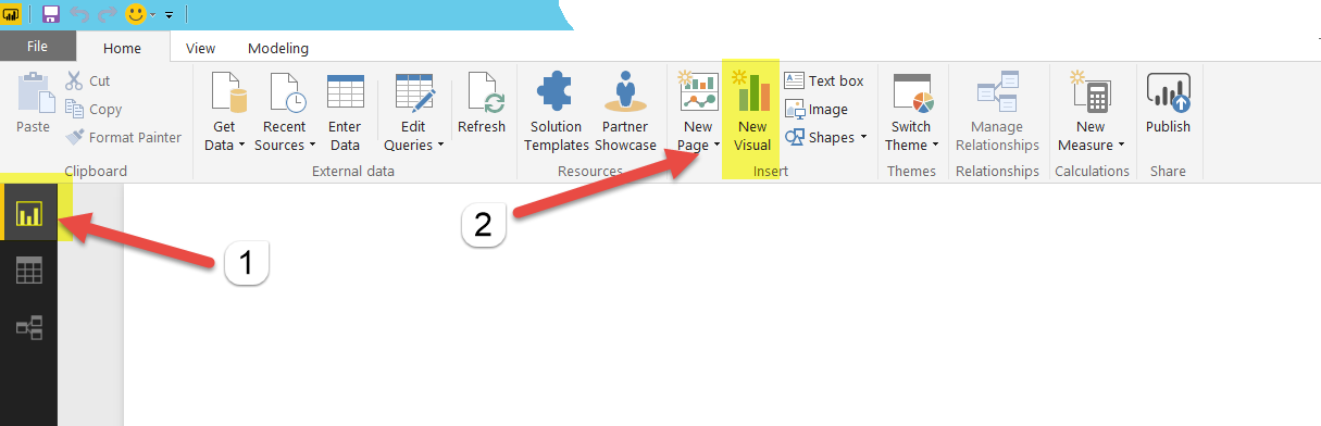
- Click the Report
- In the Home tab Insert area, click New Visual.
- Click the globe icon in the Visualizations
- From the Person column, click and drag BirthCity to the Location area
- From the Person column, click and drag Surname to the Legend area
- From the Person column, click and drag Surname to the Size area

Now you can observe some results. In this example, we are zoomed in on Europe. You can also select specific surnames at the top of the map to see where those people were born. 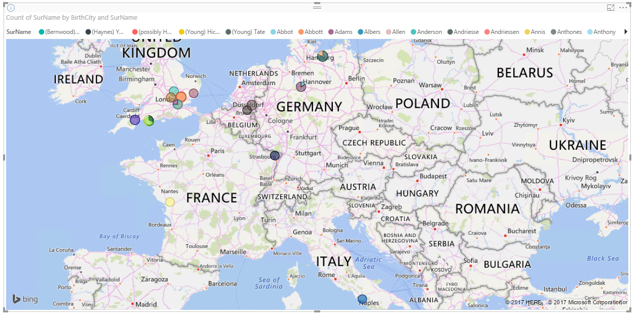
- Make sure you are not selecting the map, click Slicer Visualization.
- Select Birthdate under Fields > Person.
- Drag Birthdate to the Slicer visualization.
Now you can use dates to find specific timeframes. (Keep in mind that maps in PowerBI Desktop do not support dates before 1600.) This screenshot shows an example using the U.S. Colonies from 1648 to 1700. You can mouse over each bubble to see surnames of the individuals born in each area. In addition, only surnames from that time period are listed in the legend. 
Conclusion
This article explored the conversion of a legacy database format, the import of that format, the data manipulation, and finally the mapping of the data. Additional development beyond this point would include using more advanced Gedcom conversion tools, such as Oxy-Gen (available at http://www.oxy-gen-soft.net/index_en.php) that creates files with detailed information such as latitude and longitude.
I want to send out a huge acknowledgement to the independent software developers who created the two Gedcom solutions that were discussed in this example. They are representative of a community of programmers who create useful and interesting free tools that aid with specific solutions. As a reminder, because their work and time is donated, please respect their code and, if you feel inspired, donate to their projects!
For more information, I would recommend that you attend our Power BI training in person or on-demand online to learn more. Plus keep an eye out for more articles that dive in to the technical aspects of using PowerBI DAX and X++ code. Visit academy.rsmus.com for more information and training materials that will cover this and hundreds of other topics for PowerBI, AX2012, and MsDyn365.
You can contact our Microsoft Dynamics ERP experts or call us at 855-437-7202
by Shaun McMikle for RSM
RSM Staff
RSM empowers middle market companies worldwide to take charge of change. Our unique middle market perspective makes RSM the natural choice for growth-oriented, internationally active organizations seeking relevant insights and tailored, innovative solutions for a complex and changing world. With a global reach spanning more than 120 countries, we instill confidence in a world of change by bringing the full power of RSM to make a lasting impact on our clients, colleagues and communities.