Microsoft PowerApps is a product created to help you build your own applications with little code or need for software developers. You are able to build apps quickly using a point and click design builder called Visual Designer. There is a large selection of templates to get you started, or you can start from scratch with a blank canvas. Building an app may seem like a complicated task meant for developers but in this post, I will explain 12 key components of the PowerApps Visual Designer. This post will have you well on your way to creating your own PowerApp that could fit your clients business needs. Most of you have probably seen a Model Driven Application without even realizing it (Microsoft Dynamics 365 Customer Engagement is an example of a model-driven PowerApp), but many people have not seen how a model-driven or canvas app is created. The best way to learn PowerApps is to create one yourself, so if you have an environment with PowerApps available (https://web.powerapps.com) then you can follow along as I move forward.
At the PowerApps home screen, you have 3 options for creating your own app:

For this example, we will choose the “Start from data” canvas app option. You will see many data connectors available to you, but we will choose Dynamics 365 (D365) as our data source and click on phone layout. Next step is to choose the dataset (environment) and Dynamics CE table (entity) you want to connect to and use in your app. In the trial organization, we created a test environment as my dataset and I will use the Accounts entity table, but plenty of entities are available. Once you have your table selected click the Create button.

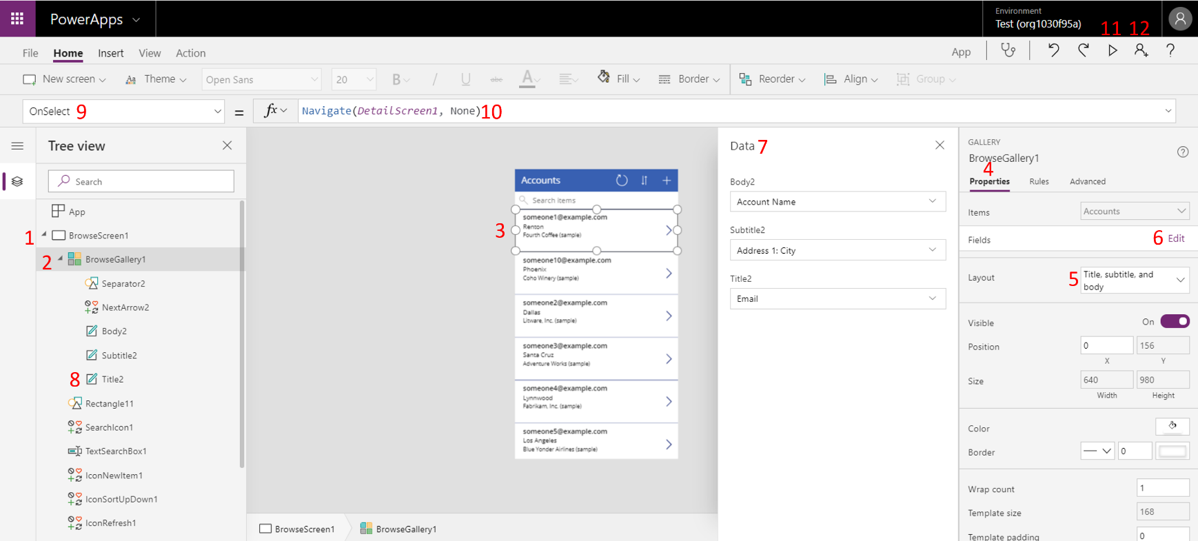
This will take you to the PowerApps Visual Designer. In the screenshot below, you will see the 12 marked components that are very important to understand how to create and customize your first PowerApp.
Visual Designer Elements
- The “Tree View” on the left is where your #1 Navigation Screens will be and you will see all of the different components for that screen under that tree. As you can see right when you create the app with the “Start from Data” option, 3 screens are automatically created for you. You have a Browse screen that includes some search functionality for the records, a Detail Screen to get a more granular view of the data, and an Edit Screen to make changes to the data.
- #2 A Gallery is how PowerApps displays a set of data and you can have many galleries throughout your app with different data sources. In the middle section, you will see exactly what the user sees for the screen you’ve selected from the tree view. This is where the point and click design comes in, you can select the different parts of the screen and customize them as needed.
- At #3 I’ve selected a card in the Accounts gallery. This is where you make changes to the layout for the data displayed for all the records in that gallery. Any changes you make to that first card will automatically take effect on all the cards below it.
- Once you select the card, the section on the right will show the #4 Properties for that card.
- An important property to look at is #5 Layout, if you click there you will see the many pre-set layouts that are provided for your data.
- If you click on #6 Edit for the fields property, you will see the different fields that are available for that entity in D365 CE.
- The #7 Data section will allow you to change any of the fields you want.
- You will see that the same labels in that data card are also under the Tree View at the #8 Label. This shows the flexibility available to make changes to your application. To give an example, you can swap out the email field for the phone field in the Title2 label. Once you do that, the change will reflect in real-time to show you phone numbers instead of emails for all those records.
- #9 Events is where you can start doing things based on a user’s input and make more changes to the data. If you click on the dropdown, you will see different events based on the component you are currently selecting in the Visual Designer.
- In the screenshot below you will see that I have the OnSelect event there and next to it is a place to put the #10 Expressions you want to execute for that event. Expressions are you how you get things to happen within your app. You can use a combination of excel like functions to create expressions. In the screenshot, you will see the Navigate function is used. So, in this case, we are letting the app know that OnSelect of that record navigates to the Detail Screen.
- #11 Preview Mode Button switches to a different screen where you are the user of the application and can test out the look, feel, and functionality of your app.
- #12 Share Button allows you to share the app with other users within your organization once you have saved and published the app. They are then able to access the app from the web, or on their mobile devices.

This post should be a good starting point for helping you build your first PowerApp. As continual updates are made to the PowerApps product, it is important to understand these 12 key components before diving deeper.
For more information regarding PowerApps see this Microsoft Website, and for specific information on designing PowerApps see here.

 RSMUS.com