“Our dilemma is that we hate change and love it at the same time; what we really want is for things to remain the same but get better.” – Sydney Harris, journalist
The Microsoft Dynamics 2013 interface has undergone some small and some significant changes to ease use and streamline your workflow, both from the usability and the functional perspectives. The Microsoft team has continued to evolve the move to a more process oriented interface that was introduced with the “December 2012 / UR12” update (commonly, Polaris) of Dynamics CRM 2011. While they have made big changes to support this new motif, they have also been busy adding tweaks to 2013 to enhance the feel and efficiency of the application as you are going about your daily activities. These changes may not be as noticeable, but they really help to make CRM 2013 faster and easier to use for the user and we’ll show you how in this post, the next in our Dynamics CRM 2013 series. Let dive into what’s new.
[highlightbold]New Navigation:[/highlightbold]
Microsoft has moved away from the “Ribbon” interface and Site Map (left hand side entity navigation) to a much thinner “Navigation Bar” that slides down to access the role-based areas, entities, etc. This really opens up the forms to allow more information to be displayed. Now, when you want to navigate to a new Area, you click “Microsoft Dynamics CRM” in the upper left-hand corner and a new menu slides down into view to allow you to access Sales, Marketing, etc.:
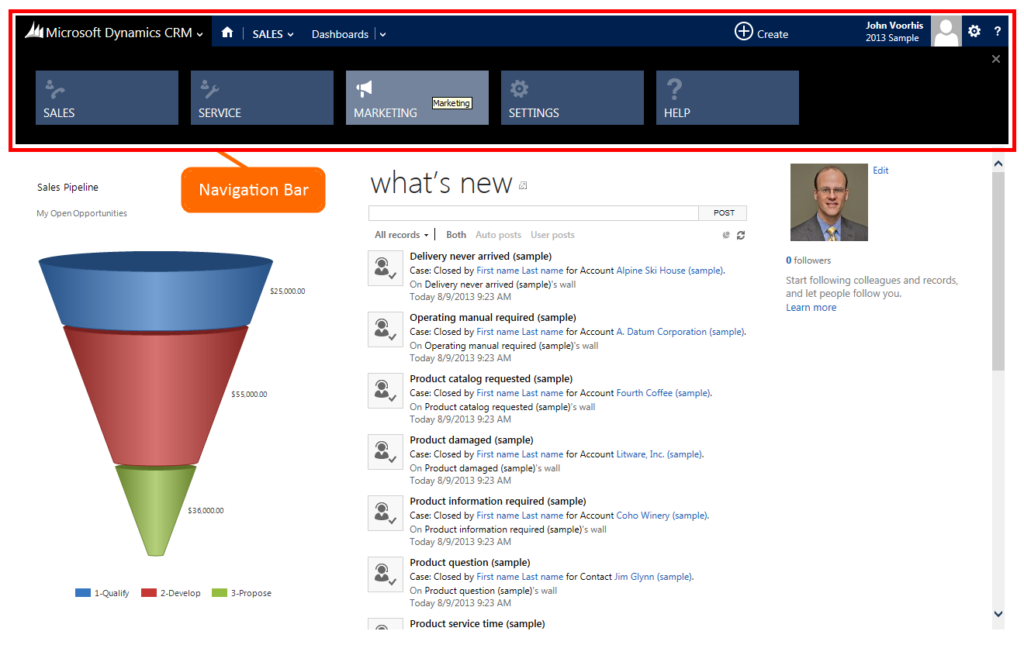
1. Dynamics CRM 2013: Navigation Bar
Once selected, the area you are working in is displayed next to the “Home” button. Here, I’ve selected the Marketing area:

2. Dynamics CRM 2013: Navigation Bar – Marketing area selected
Clicking on the area name slides down the menu of entities available for that area:

3. Dynamics CRM 2013: Navigation bar – Marketing entities displayed
Clicking on the entity name will bring you to the views for that entity (Active Account, My Accounts, etc.) You’ll notice that I’ve gone one step further, and clicked the fly-out menu indication (the “v”) for accounts. By doing so, I’m shown the accounts that I have viewed most recently. This is a great help for quickly navigating to the accounts you are working with most heavily:

4. Dynamics CRM 2013: Navigation bar – Recently viewed accounts
Continuing the interface metaphor, the entity you are working with is displayed to the right, showing you exactly where you are in the system, with the progression visible from left to right:

5. Dynamics CRM 2013: Navigation bar – Entity menu
Once you are working with an account, contact, etc. the entity primary field (is this case the account name) is again displayed to the right in the hierarchy, and by clicking on it you can access any of the related data for that record:
6. Dynamics CRM 2013: Navigation bar – Account related entities
[highlightbold]Process based – Flow User Interface (UI)[/highlightbold]
A new type of form was made available to Dynamics CRM Online customers that introduced the “Flow-UI” or process-oriented workflow form. While it’s a big change to the interface, this process oriented approach really helps Dynamics CRM to conform to the way you work as you progress through your sales, service, or business processes. In Dynamics CRM 2013, this has been further enhanced to allow the processes to be defined for any entity, including custom entities. You can now also create multiple processes for an entity, when you will need to different processes to qualify different types of leads, or working opportunities for a new customer vs. existing or different product lines for example. The visual display of the process has been enhanced to make it clearer, and you can now also view previous stage’s data. Finally, you can define which of the process steps are required and which are optional to proceed to the next stage:
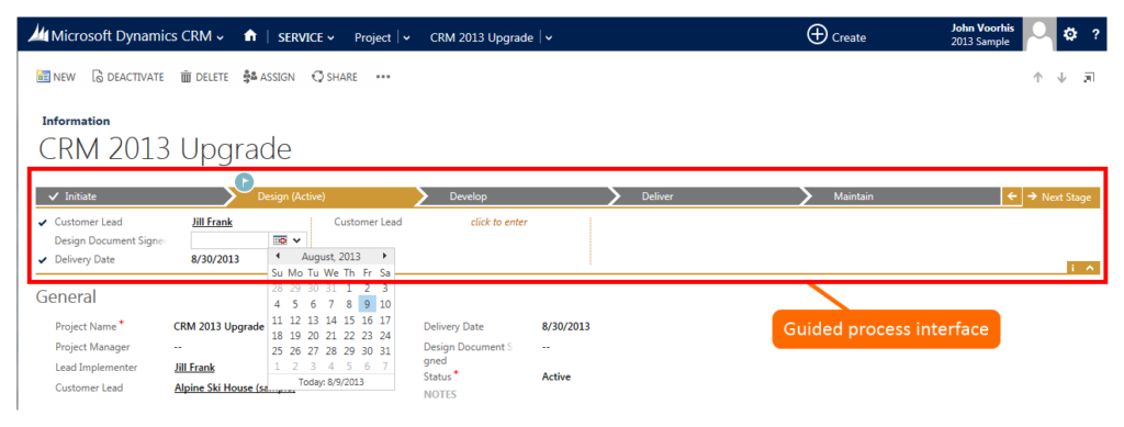
7. Dynamics CRM 2013: Guided process interface
[highlightbold]Usability Enhancements:[/highlightbold]
One of the nice enhancements that will help speed your work in Dynamics CRM is the addition of a “Create” option at the top of the application. When clicked, a list of activities and entities is displayed:

8. Dynamics CRM 2013: Quick Create
Clicking an entity such as Lead presents you with a quick form for entering the key info for the record without having to navigate away from the record you were originally working on:

9. Dynamics CRM 2013: Quick Create – Lead
Oddly enough, selecting an activity navigates to the full creation form for the activity instead of just showing a quick create form, presumably this is so you can enter notes, which would fit well into the Quick Create, or so you can pop-out the activity so you can refer back to the account, contact, opportunity record, etc.
Another nice addition to help streamline your workflow is the addition of the “Add” (+) icon in the related records display area of the form. In the past, adding a related record was a bit cumbersome, now you do it quickly by clicking the “+” icon:
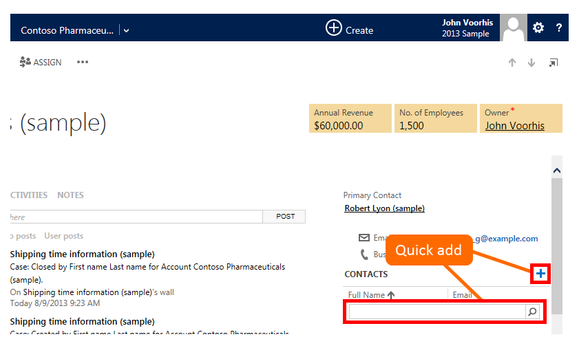
10. Dynamics CRM 2013: Quick Add
The search box is displayed, you then enter the relevant search criteria for the record you would like to add. If you need to add a new record, you can do that as well:
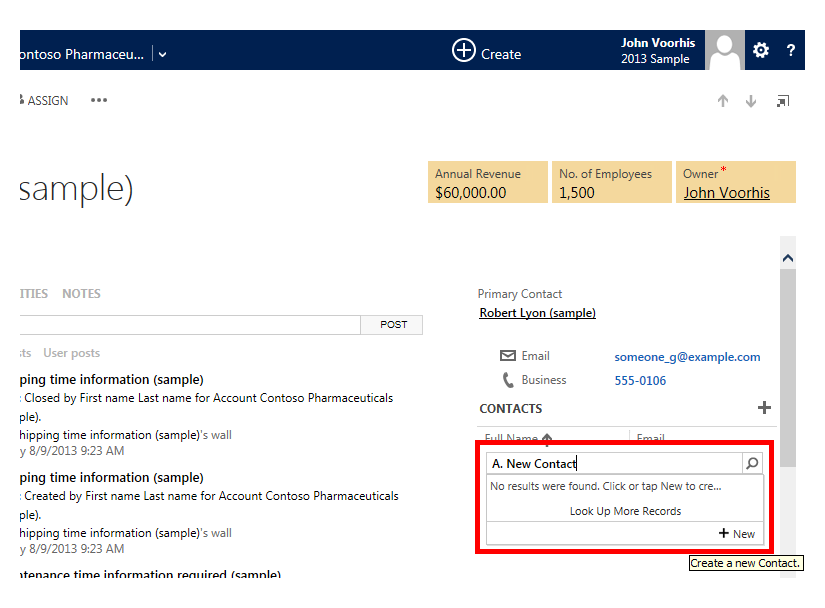
11. Dynamics CRM 2013: Quick Add – Search results, add new
When you have opened a record from a view or a search, for example by clicking on an opportunity from the “My Opportunities” view, you’ll have the option of navigating the next or previous record in the list using the new Icons in the upper-right of the record. They even work from the Advanced Find! Next to the “Previous” and “Next” icons you’ll also find an option to open the current record in a separate window. Microsoft has really taken to heart the feedback to make Dynamics CRM less “clicky” and to eliminate the multiple windows that open as you’re using the application, but they’ve added that option for those times when you still need to have multiple records open at once:
12. Dynamics CRM 2013: Previous record, next record, and pop-out window icons
While filtering of the lists and views in Dynamics CRM is not new, Microsoft has moved the command from the Ribbon to the list itself, making it more prominent and usable:

13. Dynamics CRM 2013: List and view filtering
Another example of small changes that make Dynamics CRM more usable are the new chart icons, for which they’ve added an “Expand/Collapse” icon to allow the chart to take the maximum usable space:
14. Dynamics CRM 2013: Chart add, expand, save, more icons
Views can now quickly and easily be set as the default view with the addition of a “pin” icon next the view name as show here for a custom entity:
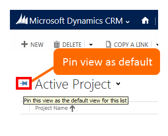
15. Dynamics CRM 2013: Pin view as default
The Activity Wall has been updated as well – Emails and appointments can now be added from the activity feed area in addition to Dynamics CRM 2011’s Phone call and task. Also, there is now the ability to filter the activities showing only ‘In progress” or “Overdue” activities. Another nice touch is that operations such as Closing an Opportunity or Resolving a Case are now shaded in a darker medium gray background, as opposed to the regular activity’s light gray and open activity’s white.
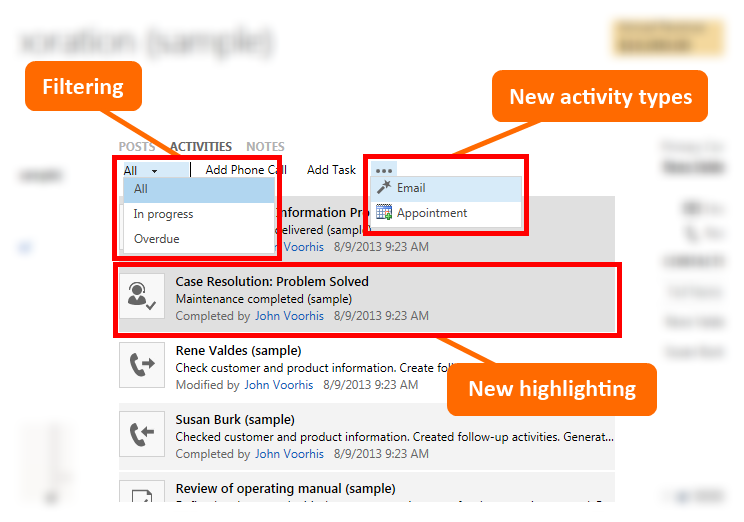
16. Dynamics CRM 2013: Activity Wall enhancements
Finally, “On-Premise” customers now get the “Flow UI” process-based forms that were introduced in the “Polaris” December 2012 update for Dynamics CRM Online customers as well, along with out of the box auto-save, Bing Maps integration, tablet touch compatibility, Skype and Yammer integration, etc. In 2011 these new forms were limited to a few Sales entities, but now all system and custom entities get them:
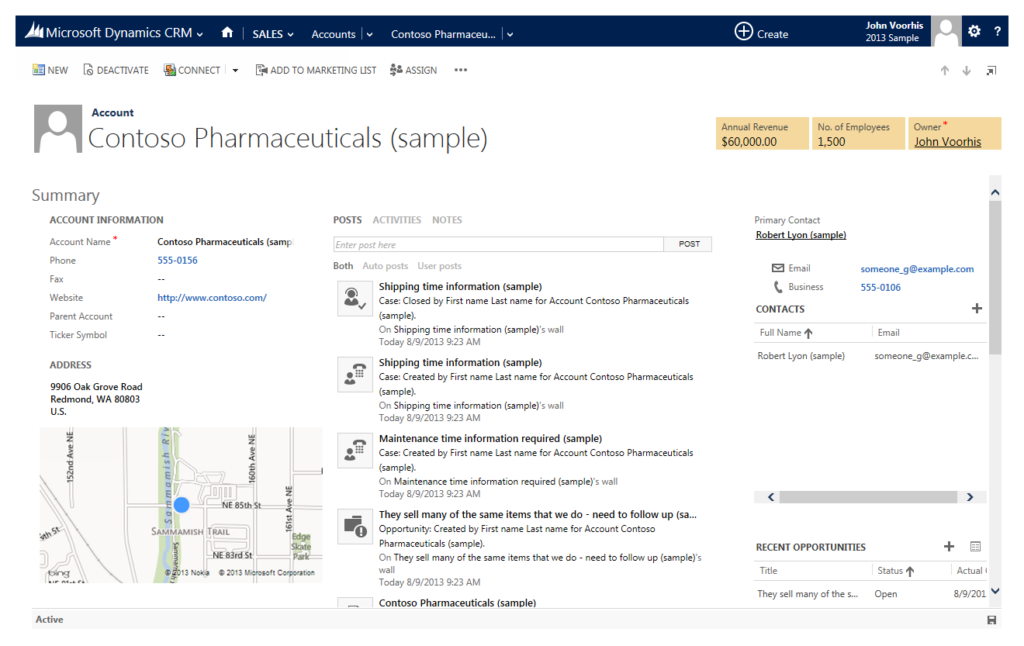
17. Dynamics CRM 2013: Flow UI (Polaris) form
[highlightbold]Conclusion[/highlightbold]
There is nothing permanent except change. – Heraclitus, Greek philosopher
Hopefully this gives you taste of the new user experience in Dynamics CRM 2013, and you’re getting as excited about it as we are. There are many more enhancements and new functionality to the mobile experience, Administration, Back-End functionality, etc., and those will be covered in coming posts. Have you found any new enhancements to the usability in Dynamics 2013 that I’ve missed or you are particularly fond of? Do you have any questions about these changes? Let me know in the comments!
If you have questions about any of the information posted, or would like help with your CRM implementation, please contact our professionals at crm@mcgladrey.com.
Read more articles on the new release of Microsoft Dynamics CRM 2013.
By: John Voorhis – www.mcgladrey.com/dynamics
Thumnail image courtesy of noomhh / FreeDigitalPhotos.net

 RSMUS.com