The Power BI November update was recently released, with many new features and visuals being released. Continue reading below to see how these features and more could benefit you!
Announcing New Power BI Color Accent
To increase Power BI’s accessibility for users with disabilities, they have switched to a new teal accent color. This new color will allow all users increased visibility across the Power BI interface.
Reporting
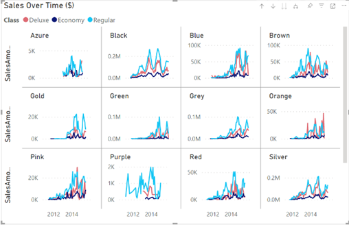
Unshared and unsynchronized axes for small multiples charts
Previously, when a user was using a small multiples visual, displaying trends against each other could be difficult due to varying ranges, causing charts with low maximums to get pushed down and appear more horizontal. Now, there are two new options to accommodate those cases: “shared y-axis” and “Scale to fit”. Both options are found in the Y-axis card of the formatting pane.

Controlling and customizing labels on Azure Maps
Controlling data labels in the base map
Using the new “Show labels” toggle in the Map settings card of the formatting pane, you can now decide if you want visible labels on your map. Toggling labels off will result in a clean map, which is helpful in scenarios where labels are not needed to interpret the shown data.
Customizable category labels
New options to customize the font and colors used for category labels can be found in the format pane.
Create dynamic slicers using field parameters
Building upon the public preview of Field parameters, the ability to parameterize slicers to support dynamic filtering scenarios is now available. To create one of these slicers, begin by adding a field parameter to a slicer, then duplicate the slicer. After selecting this second slicer, right-click and select Show values of the selected field.
Composite models over Power BI datasets and Analysis Services
It is now possible for a single table to simultaneously filter more than one table in a remote source group.
Modeling
Streamline your report authoring experience with the Optimize ribbon
The Optimize ribbon is dedicated to streamlining the process of authoring reports, with some of its capabilities including:
- Full control over when visuals refresh
- Choosing and applying predefined combinations of settings tailored to specific reporting needs through Optimization presets
- Conveniently launch Performance Analyzer to analyze the queries generated by the report’s visuals
Enable this new ribbon in Power BI Desktop by navigating to Files > Options and Settings, click on Options, select Preview features, and then select the Optimize ribbon checkbox.
New DAX function: EVALUATEANDLOG
This function takes any DAX expression, evaluates it, returns the result, and logs it to the DAX evaluation log.
Read more about EVALUATEANDLOG.
New DAX Functions: TOCSV and TOJSON
These functions convert the input Table to CSV or JSON, respectively.
Read more about TOCSV and TOJSON.
Data connectivity and preparation
Azure Databricks, Databricks
The Databricks connectors now support canceling queries when consecutive queries are sent.
Dremio Cloud
The Dremio Cloud Connector has been updated to provide customers the ability to manually enter their server name to provide more flexibility in connecting to different servers.
Kognitwin
The Kognitwin connector has been updated with the following changes:
- Add support for time series to enable monitoring of continuous sensor data
- Resolve external data flag in API
- Resolve missing data rows bug
Spigit, Projectplace, Planview Enterprise One – PRM, Planview Enterprise One – CTM
The Planview connectors have been updated with new naming.
- Spigit is now Planview Ideaplace
- Projectplace is now Planview Projectplace
- Planview Enterprise One -PRM is now Planview Portfolios
- Planview Enterprise One – CTM is now Planview Enterprise Architecture
SumTotal
The SumTotal connector has been updated with the following changes:
- Added support for filtering entity results by rowVersionId and rowVersionDecimal
- Added support for filtering results by isActive, IsDeleted flags
Service
A new way to upload Power BI and Excel files
In the workspace you want to add files to, there is an Upload option next to the New button. Using this dropdown, you can connect to files stored in OneDrive for Business or any SharePoint site you have access to or upload them from your computer.
Subscribe to a report with filters applied
When creating a new report subscription, you can select the Include my changes option to subscribe to the view of the report with any changes you’ve applied, such as filters, slicers, personalize visuals, cross-filtering or cross-highlighting, drill down or drill up, and spotlight.
Linked metrics
You can now show the same metric on multiple scorecards, across multiple workspaces, with all check-in, edits, and updates being reflected in all the metric locations.
To link a metric, go to edit mode and select “Link to existing metric” from the “New” button within a report you have build access to. Then, pick the scorecard that contains the metric you’d like to link, and select the metrics within that scorecard. Once you hit “Continue”, the linked metric(s) will appear.
Information protection update
There is now the ability to import files from OneDrive or SharePoint Online when they have sensitivity labels applied.
Paginated Reports
Formatted Table authoring experience
There have been additional capabilities released to formatted tables:
- Accessible Navigation through the Ribbon toolbar
- Press Ctrl + F6 to navigate to the ribbon section, and once there, use Tab to move.
- Grand Totals for Table Format
- Move and Resize

Visualizations
New visuals in AppSource
New visuals include:
- Traqplan Timeline and Roadmaps
- Supermetrics Charts – Tile grid map
- CP Radar Chart
- Sankey Diagram for Power BI by ChartExpo
- Gantt by Lingaro
accoPLANNING by Accobat
Key new functionalities:
- Shadow calculations
- General enhancements
- AppSource license handling
ADWISE RoadMap / Gannt v2.5
New features:
- Tree hierarchy
- Groups and SubGroups
- Actual vs Plan in Bars
- Additional Info column
- Legend
- Fiscal year logic
- Time interval/period zoom
- Go To Today
- Multiple new formatting options
Control Chart XmR by Nova Silva
New features:
- ZoomSlider support to the Control Chart XmR, making it easier to navigate through time
- Allowance for multiple targets
- Ability to review all the signals in a table
Zebra BI Cards 1.3
New features:
- Three different layouts for KPIs: custom, rows, or uniform
- Adjust the background and border color of all cards globally or just of specific KPIs.
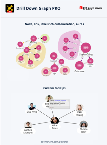
ZoomCharts Drill Down Graph PRO
This new custom visual allows for the creation of complex relationships between nodes in a highly intuitive graph.

Other
Power BI Desktop infrastructure update (WebView2)
Starting with this release, Desktop will check if you don’t have WebView2 installed, and will install it for you if not. This is one of the final steps being taken before WebView2 is mandatory for using Desktop, so install and enable it if you haven’t already.
Stay tuned for future updates and be sure to download the latest version of Power BI: Download Power BI Desktop November Update
See the full list of November updates here: Power BI November 2022 Feature Summary
If you have any questions regarding this month’s update or Power BI in general, contact our professionals here.

 RSMUS.com