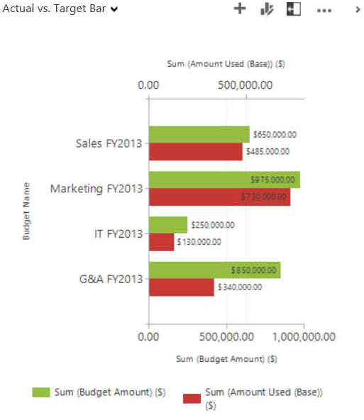
With all of the data being stored in your CRM system, it’s important that information managers and executives are seeing it summarized in an easily consumable fashion. This need is typically met using dashboards and charts. Microsoft Dynamics CRM comes with some great dashboards and charts out of the box but often to meet the desires of managers and executives, customizing the dashboard and charts is required. Recently an online client asked that a chart be created to display Used vs. Budgeted. The standard bar charts didn’t best communicate the information so we did some customization for the client.

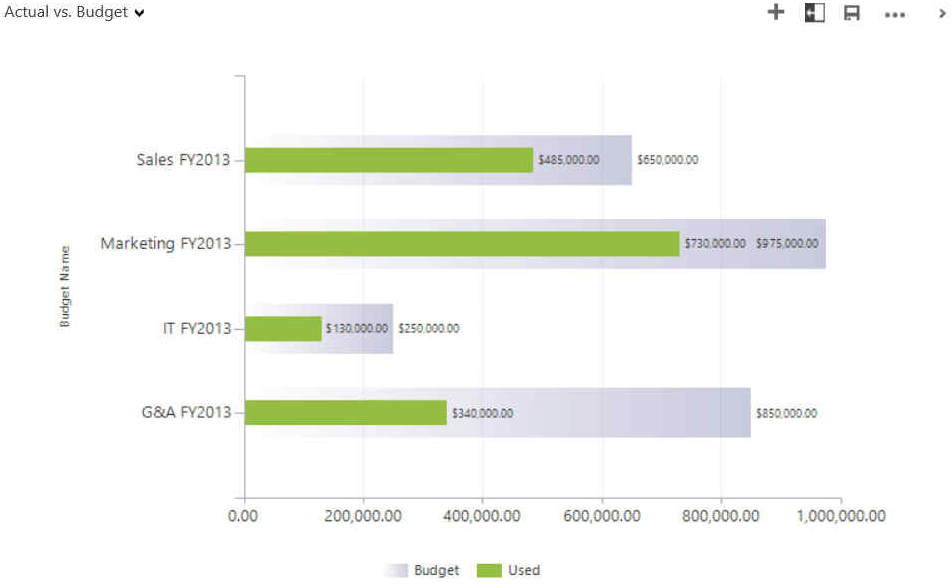
A couple of things wrong with this chart is that it is displaying 2 Y-axis and the preference was that the bars were overlaid instead of side-by-side. After doing some research, I came across an article by CRM Chart Guy that summarized what I was looking to do. After following his post, I was able to customize it to look like this.

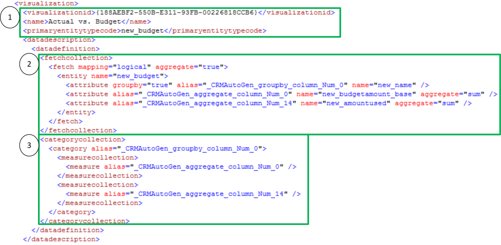
Often when met with a reporting requirement, my first instinct is to jump into SSRS instead of customizing a chart in CRM. Going through this exercise allowed me to see the potential that simply customizing the chart XML has. To get the most out of customizing charts, it’s important to understand the pieces of chart XML.

1) Data about general information regarding the chart: the GUID of the chart, the name of the chart and the entity it is related to
2) The determines which fields will be used in the chart. Use this section pull information from related entities. Use this section change how the information is being aggregated
3) The determines the category and series information

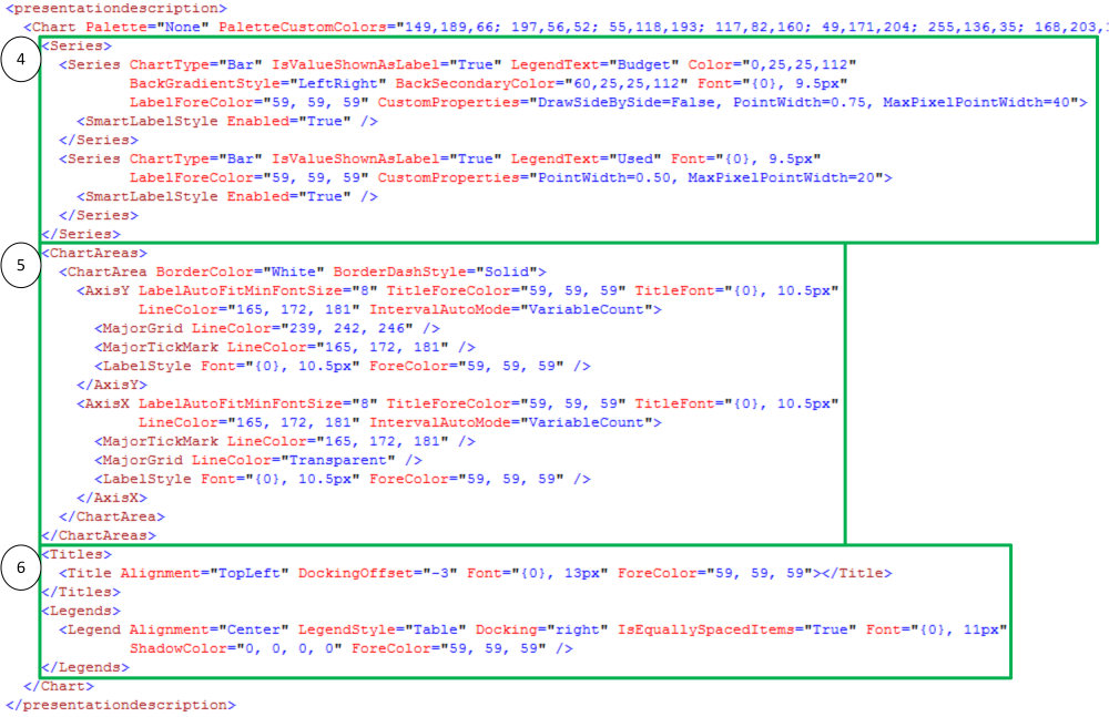
4) contains data about how each data series is being displayed. Customize the type of chart (see Additional Information for list of chart types) i. Make sure that your chart type is supported by the data ii. Each chart type has specific attributes that should be followed. Customize how the chart is displayed: color, font, size . . .
5) controls how the x-axis and y-axis are displayed a. The syntax for this section will change based on the chart type
6) determines how the relevant information about the chart will be displayed By understanding the key areas of the XML for charts, it allows you to create charts that managers and executives can more easily consume.
Additional Information:
Understand Charts: Underlying Data and Chart Representation
If you are struggling with chart XML in Dynamics CRM, we can help. Contact our professionals at crm@mcgladrey.com.
By: Seth Bacon – Colorado Microsoft Dynamics CRM partner

 RSMUS.com